

ALARABIYA GROUP News Network, the first Arab News channel launched in 2003, is now embarking on the largest expansion in its history comprising new reporting capabilities, a new multimedia newsroom, fresh opinion writers, expanded social content and a transformed website and app. The expansion began in 2019 and will accelerate in 2020 with a four-fold increase in the reporting team. ALARABIYA GROUP has developed its new brand identity in conjunction with the leading Arabic calligraphy and typography experts, the Boutros Group, who handled all aspects of the typography involved.
The Boutros Group has led the field of Arabic creativity, typography, calligraphy and design for more than 40 years. Based in London, the company has long served the needs of the Arabic-speaking world, as well as of international corporations seeking to communicate with the Arabic market. Projects have ranged from the creation of Arabic typeface collections for internationally renowned software and design houses to corporate Arabic logotypes and private commissions.
The Boutros Group has provided expertise to IBM, Apple, ALARABIYA GROUP, the MBC group, Google, Almarai, Mini and BBC Arabic, to name just a few. Its founders, Mourad and Arlette Boutros are widely acknowledged as two of the world’s most outstanding Arabic calligraphers, designers and typographers.
In a talk with ArabAd, Boutros discusses the new brand identity and the commitment to Arabic culture, calligraphy and typography. Arlette Boutros elaborates further on the specificity of this new type and logo. The Brief was clear and stated that the network required its existing logo and typeface to be rebranded, taking into account the latest technology that was not available 17 years ago, while maintaining the characteristics of the existing typeface.
Boutros developed five weights instead of the existing two Arabic only (designed by Arlette Boutros). Boutros, in collaboration with the well-known Latin designers, Dave Farey and Richard Dawson also produced an equivalent Latin font in harmony with the Arabic, in style, weight and legibility.
For Boutros, it was another challenging typeface commission, especially with all the technical limitations requested by ALARABIYA GROUP.
In Harmony
The five new ALARABIYA GROUP fonts (above), showing the same weights in both languages (Arabic and Latin) demonstrating their visual balance and their clarity in style, weight and legibility.
In 2003, the technology only allowed about 256 characters in a character set which meant simplifying the characters, while today technology allows around 64,000 characters (Glyphs).
This means you can include as many languages as you can fit in one font - Arabic, Latin and their derivatives such Urdu, Farsi, Western and standard European, Greek, and Russian to name but a few.
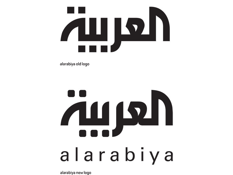
The logo redesign is a face lift that aims at keeping the spirit, look and feel of the old logo, whilst providing a new rejuvenated look.
The different letter shapes have been slightly curved to provide a coherent overall look and to mimic the notion of broadcasting.
The logo retains its proportional scale and spacing to provide a solid and well-balanced overall visual solution.
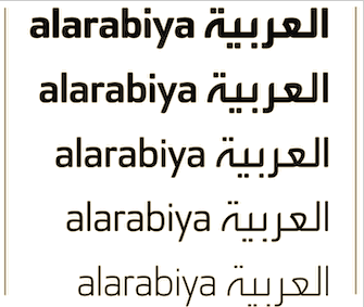
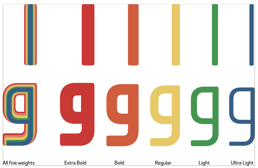
Above: The five weights

The newly rebranded ALARABIYA GROUP typefaces made of 5 weights, (where the ascenders and descenders should not go above or under the top or the bottom lines). They are a modern geometrical style with soft round edges, which make it very readable at various angles, sizes and distances. When joining characters, it looks prominent and stylish. It is particularly suitable for headlines, sub-headings and body text. The ALARABIYA GROUP typeface is slightly condensed which makes it more beautiful and better suited to TV screens to fit more text without affecting legibility.


